Piano's building offers a new glass and steel entrance pavilion along Evans Way. To the right is the palace. To the left are new greenhouses with apartments above for visiting artists. Its sleek glass façade rises at an angle, giving a good impression of a space station. A short glass corridor, flanked outside by bushes and trees, leads from the entrance into the building proper. On the left are a shop, elevator (surrounded by bookshelves), and classroom. On the right, coat check, "living room," stairs, and café. The walls are brown brick. The floors are bluestone tile. The gray doors of the elevator open to a leafy green interior.

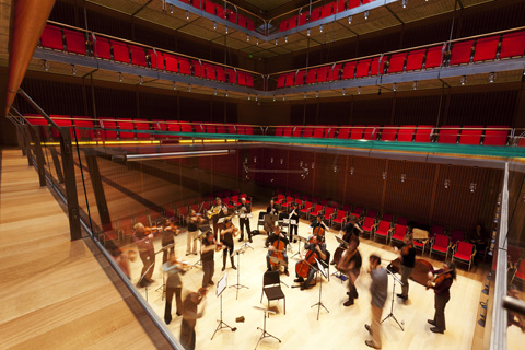
SOUND GALLERY The 300-seat concert hall seems to have been Piano’s favorite part of the project. |
The furnishings of the "living room" are representative: mod red, orange, and white couches and chairs, red hanging lamps, wooden shelves filled with books, and bird cages with live twittering birds. The "living room" is supposed to be an orientation room/hangout, but it's hard to imagine who would use it much outside of, say, people at concerts or evening mixers. Like classic modernist homes, the building's bones are strict, geometric, and industrial, but ferns, warm hues, and soft fabrics make it feel nesty. "Too much intelligence would spoil the addition," Hawley says. "It had to be emotional. It had to be sensuous."
Rather than adopting the grandiosity of many recent museum projects — from the Museum of Fine Art's new atrium to his own 2009 modern wing for the Art Institute of Chicago — Piano keeps the scale modest and cozy. There are no giant halls. It's a public building with a domestic feel. "What we wanted to do is keep the intimacy that the Gardner has," Hawley says.
The second floor offers a 300-seat concert hall and a special exhibition gallery. Administrative offices, conservation labs, shipping, and art storage also fill the upper floors and cellar. The concert hall, which seems to have been Piano's favorite part of the project ("I wanted to be a musician myself, but I wasn't good enough; so I decided to be an architect"), eschews the typical shoebox design for a vertical orientation, with the performers at the center of a square wood floor and the crowd watching from four sides and down from three levels of glass-and-steel-fronted balconies. A string ensemble rehearsing there last week demonstrated how acoustician Yasuhisa Toyota of Nagata Acoustics got the room to resonate with a full and crisp sound right up to the fourth floor. Piano keeps the audience close to the performers — the first floor has two rows of red seats, the other floors each only have one. "You also enjoy the face of the person in front of you who is also enjoying [the music]," Piano says. For him, this reinforces the audience's shared experience and fosters community.

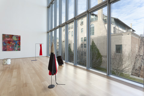
MORE LIGHT Architect Renzo Piano effectively complements Gardner’s inward-looking building with a building that gazes out. |
The new special exhibition gallery is down the hall. A small, dim gallery (currently devoted to art produced by artists during residencies at the Gardner — all of it minor) opens into a tall, sunny room. This new gallery is a flexible space: the ceiling can be raised and lowered from 12 to 36 feet and the windows shaded to protect light-sensitive art. One wall is all windows — the largest unbroken view from the building — offering a breathtaking vista of the palace and the Boston skyline. "The palace is constantly the object of desire," Piano says of the building's many windows. Piano effectively complements Gardner's inward-looking building with a building that gazes out.