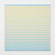
GLOWING HORIZON Walsh’s Table. |
When Minimalist art began in the 1960s and ’70s, it was difficult stuff. Painters reduced their vocabularies to lines and grids as they pared painting down toward its essential ingredients. It was often severe, ascetic, and buttoned-up, a sort of colonic for the senses predicated on the notion that if you concentrated on it hard enough — and were worthy — you might discover transcendence.But Dan Walsh’s works in “Uncommon Ground,” a selection of eight paintings plus three handmade books chosen by curator Judith Tannenbaum at the RISD Museum (224 Benefit St, Providence, through October 21), are part of a warming trend in Minimalism that is also seen in the crowd-pleasing sculptures of Anish Kapoor, Tara Donovan, and the like. It still has the clean, fresh simplicity of classic Minimalism, but now it’s sweeter, friendlier, more playful.
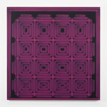
Walsh still adheres to lines and grids as can be seen in Visitor (2009), a grid of violet concentric squares against a black background. As in classic Minimalism, the paintings are about process. You can see how it was built, how each brushstroke was dragged across the canvas. The grid, which can often seem mechanical, is softened by Walsh’s not-quite-perfect marksmanship. The lines wiggle and wobble a bit, vaguely doodley, making the composition more obviously handmade and human.

WORK IN PROCESS Walsh’s Visitor. |
This seems to reflect the more modest aims of abstract painting today. In the 1960s, Minimalism righteously sought to define painting’s final frontier. Now it’s more about just having a good time. So Walsh can achieve the calming, meditative effects of Minimalism while amplifying color, tone, and his touch to produce more fun. Visitor ’s pattern, a bit like a log cabin quilt, vibrates. And the semi-transparent paint, brighter and more opaque where lines overlap, seems to glow against the dark background.The patterns of other paintings suggest Islamic tiles or Morse code. In Table (2010), Walsh gets a glowing horizon effect with bands of blue stripes on a pink background. The blue marks’ rounded ends suggest cartoon clouds. At bottom, the blue stripes are plain but, as Walsh moves upward, he paints them with more and more yellow, turning them green near the center and bright yellow at top, as if lit by sun. It recalls Georgia O’Keeffe’s Sky Above Clouds paintings of the 1960s.
Walsh’s paintings of the early 1990s were stricter, resembling charts or diagrams. He then moved onto squares and rectangles of color. The canvases here from the past decade are softer, more impressionistic, while maintaining aesthetic roots winding back to Mark Rothko’s hovering color fields and Frank Stella’s black stripe paintings of the late ’50s. If you know your 20th-century art history, Walsh’s visual associations feel pleasantly familiar.