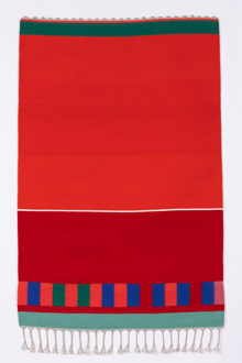
‘HUNTER ORANGE #2’ Wool and linen, 69 x 46 in.,
2012, Morris David Dorenfeld. |
Some artists’ imagination thrives under constraint. Setting up rules of engagement or facing material and technical limitations frees them to experiment within these internal or external parameters. That seems to be the mindset of weaver Morris David Dorenfeld, who continually discovers new compositional possibilities in the rigidity of his loom’s warp and weft. Icon Contemporary Art in Brunswick shows 15 of Dorenfeld’s tapestries illustrating this range from incremental repetition to all-encompassing composition, from eye-pleasing color harmonies to high-key contrasts, from serenity to vivacity.
The few works Dorenfeld produces each year are carefully planned out, mostly in series exploring specific formal elements. Until around 2009, the tapestries have a uniform background color in which horizontal bars and dots of varying color and length are carefully arranged to energize the space evenly with unifying proportions and balances. The oldest work at IconN, “Wheeler Bay III” of 2005, still resonates with abstracted references to land and seascapes. In muted natural colors, clusters of thin horizontals, small squares, and rectangles evoke reflections on water. Later work includes open and closed squares and rectangles, so that space itself and coloristic and formal correspondences gain in importance.
Due to the weaving process the sideways border between colors is jagged, adding a lively tension to the line of contrast. Generally, a palette of wool in basic red, black, yellow, purple, green, and pink predominates. Their specific hues and often complementary pairings are sometimes rather unexpected, which speaks to the supremacy the artist gives to color. Dorenfeld, who is 76, initially studied painting and apparently has remained a painter at heart. Although the repetitive, meditative process of weaving seems intrinsically linked to the artist’s conceptual approach, in the final product, process and material-based effects are downplayed. The tapestries are very tightly woven, aiming for flatness to highlight pictorial elements alone. However, as perfect as they are, undulations and slight variations in thickness add what I consider a welcome respite from control and remind us that we are, after all, looking at fibers with weight and volume. Looking closely, one will also discover slight variations in color here and there, possibly nothing more than different dye lots. And then there are the real oddballs: a stripe finished in another color, one side of a square a different color from the rest. These “imperfections” remind me of Native American spirit lines, deliberate breaks in the pattern of woven blankets that are said to allow the spirit of its maker to escape, but are also interpreted as an admission of human fallibility.
My favorite tapestry, “Hunter Orange #2,” reads like a good modernist painting with proportions and colors chosen and arranged into a complex overall composition. Within the band of vertical rectangles at the bottom lies my punctum. At two points, instead of orange, blue, green, and pink, there are red rectangles, the same color as the “background,” breaking up the solidity of the band. Any concept of figure and ground becomes moot as all are one, on one plane and of one reality. Which is the way of weaving.
The work introduces the “Hunter Stripe Series” of all-vertical stripes, saturated with brilliant colors, orange, of course prominent among them. They brazenly evoke common afghan blankets in color and composition — perhaps a comment on hunting culture?