QUIET RIGOR Walsh's 'tinker's curse.' |
“The golden age of abstraction is right now,” ARTnews informed me last spring. The evidence, the national magazine explained, is that there’s a shitload of “good abstract art being made today, and the best of it is as good as the best abstract art of the past.” Also museums are filling their halls with the stuff.
That’s the context for a show like “We Don’t Make Mistakes,” a group exhibition of abstract paintings and sculptures by local artists at the Wheeler School’s Chazan Gallery (228 Angell St, Providence, through March 27). A lot of the abstraction that is prominent nationally tends to be flashy and spectacular or odd and hermetic. The art in this show feels serious, measured, thinky, assured, reserved.
This local flavor is particularly apparent in the way the artists are attuned to their materials. In part, it’s the craftsmanship — that often seems related to what they teach at RISD. In part, the paintings seem to reflect Providence’s architecture — the rust of bridges, the layers and layers of paint on walls of old mill buildings, the way the life and history of the place is apparent in its well-used structures.
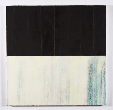
Neal Walsh, the gallery director at AS220, offers his painting tinker’s curse, which you may recall as the best piece in his show at 186 Carpenter last year. The four-foot-square painting divides into two halves that contrast thin and thick, dark and light. The top is filled with tarry black vertical strips of salvaged canvas that read like paneling. The bottom is white stained with blue, like a wall damaged by water leaking from a bad roof. The painting exemplifies Walsh’s quiet rigor, patiently accumulating layers, building up allusions to architecture and histories.
Walsh’s first painting leaves you wanting more and bigger. It’s accompanied by three additional works, each as small as a sheet of copier paper, which makes them feel like studies. In the best of them, oh true believers (2014), a layer of rust brown paint seems to flake off to reveal patches of blue-gray and a red that faintly aspires to glow like sunsets.
Shawn Gilheeney’s 2014 painting Foundations #2 is composed of minimalist horizontal stripes — bare wood smeared with white paint, then a band of matte black, then wood again, and a band of white, thin and washy, perhaps sanded down. Like Walsh, Gilheeney evokes old industrial architecture with the way he layers and smears his paint. And he burns a sketch of an old iron bridge into the wood. One by one these elements are compelling, but they seem to compete for interest, not coming together in concert.
Sam Duket’s 2014 wood sculpture Mistake 1 looks like a couple of curved beams of wood, wedged between the concrete columns of the gallery wall. The surface is designed with masterful marquetry, handsomely piecing together veneers to create an optical illusion that the wood is bending in or out from the wall. It’s a trick of perspective lines, but it feels like a self-deprecating sight gag, acknowledging the smarts behind the minimalist design while teasing the seriousness of it all.