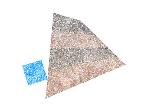
‘SCARA BRAE 1’ ink on paper by David Raymond, 2014 |
David Raymond can make substantive art with very little actual substance. A sculptor, painter, poet, and art writer who has been teaching at Merrimack College in North Andover, Massachusetts, since 1964, Raymond is showing 21 recent ink on paper drawings at Brunswick’s ICON Contemporary Art. It is yet another superb showing of excellent and thoughtful abstract art at that venue.
The drawings combine seemingly irreconcilable approaches, tendencies, and frameworks of reference. They are the progeny of hard-edge painting in their tight arrangements of geometric and organic shapes in a palette limited to five colors at the most. Exploring dynamic tension and equilibrium, the compositions are highly interesting and well-conceived (except the phallic ones). In “Tuned House,” a circular segment teeters on the edge of a vaguely anthropomorphic one (think matryoshka doll), both shapes dissected at the same imaginary line into two colors.
The alignment of rounded and angular shapes posits the individual elements as separate yet of one piece as well. Placement of the configurations on the sheet is highly deliberate and important in terms of weight and balance, making them appear monumental on a small scale. The configurations read as flat, not even floating on a background, but rather as accretions, pierced by air (many of his recent sculptures have perforations), without gravity or substance, made of pulsating matter. The undulating shape in “Tuned House” is in fact not hard-edged but rather frayed at the edges. Actually, Raymond’s shapes have no edges. They are built up of nothing but small, incremental marks.
Seen from afar, the drawings appear of low-intensity colors and stippled or marbleized with dense and lighter areas. Seen up close, they reveal themselves created in a language of circles, rectangles, ovals, and short parallel lines, and the space between them—simple, yet infinitely suggestive. The linear and circular lacunae are distributed to evoke a multitude of associations from cellular structures to that of the universe, scale remaining ambiguous. Landscape is suggested through topographical patterns but also map-like symbolism. There could be ancient mounds and crop circles, or imagery captured by satellites and military surveillance. Each work could describe the ruins of a civilization.
And this is where Scotland comes in, apparently the source of inspiration for many of these drawings. Several titles refer to villages, islands, and ancient structures there. “Scara Brae 1,” one of three drawings referencing the Skara Brae ruins of a Neolithic settlement, features an irregular quadrilateral filled with horizontal bands of two different browns, like archeological layers. The blue square abutting it is made of more fluid, interwoven marks, suggesting the coastal location of the site. As in all multi-colored works, the transition from one color to another, whether within one shape or between shapes, occurs without visible hesitation or break in the inner language of marks, the artist switching pens in mid-stride. This internal patterning making up the shapes is pretty much the same for all, except in a few cases where dense striation covers fields of ovals. These pieces are less satisfying because too uniform.