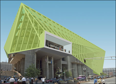
Rethinking design at the ICA, and City Hall at Pinkcomma Gallery
By DAVID EISEN | October 10, 2007

CHANGING WITH THE TIMES? Höweler + Yoon proposes wrapping City Hall to create new public
spaces that will connect it to the plaza below. |
| “Design Life Now” | Institute of Contemporary Art, 100 Northern Ave, Boston | Through January 6 | “Rethinking Boston City Hall” | Pinkcomma Gallery, 81b Wareham St, Boston | Through October 26 |
Two new exhibits take design — the familiar background of our daily lives — and give it immediacy in a gallery setting. Hovering above the waterfront at the ICA, “Design Life Now” is a polished production that overviews the new and flashy. “ReThinking Boston City Hall,” at the subterranean Pinkcomma Gallery, offers some insight into the renewal of the old and unfashionable.“Design Life Now” originated at the Smithsonian-Cooper Hewitt National Design Museum in New York last winter, the third in the museum’s triennial series, following “Design Culture Now” in 2000 and “Inside Design Now” in 2003. The shows have always been a bit of grab bag, but against the backdrop of the Cooper Hewitt’s intimately scaled interiors and 19th-century ornamentation, the up-to-the-moment works have cohered as a statement about modern sensibilities. This one is the first to make its way out of New York (it travels to Houston in January), and it’s been redesigned for the ICA’s white-box galleries. Architect and Harvard Design School professor Michael Meredith has built out the space with a series of thick parallel plaster walls inspired both by the rows of industrial shelving at big-box discounters and by the streets, alleys, doorways, and windows of traditional urban centers. Openings channel movement through the exhibition and past individual objects framed by recesses carved into the plaster.
At its best, the exhibit re-examines the unity of form and function that’s the hallmark of great design. The more familiar objects on display include everything from Nike sneakers and the iPod Nano to Thom Browne’s men’s suits. In the realm of domestic design, ReadyMade magazine upends ideas of fine furnishing. Recycled soda crates become drawers in a storage unit whose shell is made of cut-out plywood; a chandelier is made from chopped-off water bottles stuffed with electric lightbulbs. Chip Kidd’s book covers compress literary narratives into visual images — the jacket for Jay McInerney’s The Good Life shows plates, forks, and spoons covered with what we recognize as World Trade Center dust. Even the most familiar objects reach out and grab you with their takes on the tried and true. The humble prescription pill bottle of Deborah Adler and Klaus Rosburg is color-coded and shaped for easy reading in such an intuitively obvious way, you want to kick yourself for not inventing it first.
The exhibit is less successful when the works require explanation. iRobot’s Roomba and Scooba may be well designed, but here they are forms with no clear functions. Why not turn these futuristic cleaning appliances on and let them loose so we can see them in action? Or better yet, slice them open and peel off their skins so we can watch the gears going round. Boeing’s new Dreamliner widebody jet may be a radical departure from the typical airplane, but the photos on the wall and tacked-on text don’t make the case. Let us sit on a seat, electronically dim the windows, or take a virtual trip. Interactivity might provide a “Eureka!” understanding.
 Related
:
Eye on you, Interplay, Majoring and minering in theater, More 
- Eye on you
Oskar Kokoschka is reputed to have asked, if the Louvre were burning and you could rescue either the Mona Lisa or a cat, which would it be? Slideshow: "Super Vision" at the ICA
- Interplay
Caitlin Berrigan’s 2009 video Transfer is simple and elemental.
- Majoring and minering in theater
The re-enactment is part community therapy, part exorcism; the resulting video is tense and visceral and heartbreaking.
- New new things
Robolobster, an underwater crustacean with eight plastic legs and an industrial-strength plastic shell, is a groundbreaking example of the new science of biomimicry.
- Questioning the Real
The Maine College of Art’s MFA thesis group show rides a questionable line between relevant social critique buoyed by valid critical theory and an egocentric interplay of misplaced postmodern gestures.
- When worlds collide
We humans are quick to anthropomorphize the non-human.
- Dear Ketel One drinker
That weird Gothic lettering, the direct yet formal tone — what exactly are Ketel One Vodka’s ads supposed to signify?
- Dullsville
I waited in a crowd for two hours before finally getting into Boston’s new Institute of Contemporary Art on opening day, December 10. Just then a mother rushed out the door, telling her husband and their four little girls, “They say another hour.”
- Tempo tantrum
In 2008, the fourth dimension, time, steps to the fore in the art world.
- Smoke and mirrors (and elephants) at the ICA
Not into wheatpasting and framed posters? The ICA is about to serve up two shows by artists who promise not to pop up on street walls all over the city.
- Game show
On November 12, the Institute of Contemporary Art opened its biennial Foster Prize exhibit of “Boston-area artists of exceptional promise.”
- Less

 Topics
:
Museum And Gallery
, Politics, Chip Kidd, Jay McInerney, More  , Politics, Chip Kidd, Jay McInerney, Museo Guggenheim Bilbao, Culture and Lifestyle, Harvard University, Hobbies and Pastimes, Local Politics, Visual Arts, Institute of Contemporary Art, Less