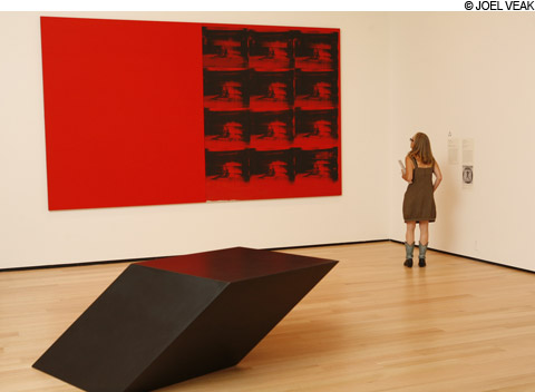
RED DISASTER Andy Warhol’s 1963 screenprinted photo of an electric chair is a highlight of the
Linde Wing — why not hang all the MFA’s Warhols? |
A conundrum lies at the heart of the Museum of Fine Arts' Linde Family Wing for Contemporary Art, which debuted last weekend: how does a museum showcase a subject it has long neglected?
> SLIDESHOW: Scenes from the opening of the Linde Family Wing for Contemporary Art <
The answer from Edward Saywell, chair of the contemporary wing; senior contemporary curator Jen Mergel, and their team is to just act as if the MFA hadn't overlooked contemporary art for decades, and elegantly conceal how thin the permanent collection is by grouping some 240 artworks (including loans) by themes ("Familiar — Altered," "Quote? Copy? Update?") rather than chronology.
Ultimately, the curators give a CliffsNotes-style, conventional history of art of the past five decades: Picasso, poured color-field painting, Pop, Minimalism, appropriation, multiculturalism, and the uncategorized tumult of the past decade. This approach can highlight gaps (big names like Chuck Close, Barbara Kruger, George Segal, Ed Ruscha, and Cindy Sherman are often not represented by their best work), but also signals the MFA's desire to compete in the contemporary-art big leagues.
Highlights include Kara Walker's 2002 fantasia of antebellum sex, race, and violence in large, elegant cut-paper silhouettes (The Rich Soil Down There). Also check out Lynda Benglis's 1970 aluminum lava flow, Anne Truitt's 1978 blue-and-purple-striped column, Doris Salcedo's 1989 baby crib enclosed in woven wire like a demonic cage, Kiki Smith's 1994 naked bronze spiderwoman climbing the gallery wall, and El Anatsui's 2009 bottlecap African tapestry. Andy Warhol's 1963 Red Disaster — a photo of an electric chair screenprinted repeatedly across a field of blood red — is one of the most striking things he ever did.
"We wanted to open with what we feel is an incredibly strong statement of what we do have," Saywell tells me. "We are obviously acutely aware of what gaps are in the collection." The aim is to backfill via purchases and (mainly) donations, with areas like Minimalism a priority. This belated keeping-up-with-the-Joneses is both stultifyingly status quo and, well, thrilling. Can they pull it off?
Consider the hyped new acquisition, Christian Marclay's 24-hour video The Clock (2010), which won him the prize for best artist at this year's Venice Biennale. It assembles movie and television clips that include references to specific times (through dialogue and images of various kind of timepieces), synched to the exact time of day that you're watching it. Marvel at the astonishing research that went into finding all these clips and weaving them together into this "working timepiece." There are jolts of nostalgia when you recognize films and faces. You latch onto snatches of micro narratives amidst a wash of noir, James Bond, and Big Ben, plus references to Time Bandits, Back to the Future, and Groundhog Day. The video crescendos at midnight and High Noon. The wee early morning hours (which I was unable to stick around for opening weekend) are said to turn dreamily surreal. It might be best to stop in for 10- or 20-minute viewings at different times of day. Sustained viewing evokes a time's-a-wasting sensation of restless channel surfing. (Your next chance to see a 24-hour screening of The Clock will be October 9-10, 4 pm–4pm; viewing of The Clock during regular museum hours run through October 8.)