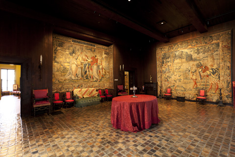
REVIVED The unpacking of the Gardner palace via the Piano wing’s new space has allowed the museum to restore some of the Tapestry Room’s original magic. |
The challenge from the start of the Isabella Stewart Gardner Museum expansion project was: how do you follow up a masterpiece? The 99-year-old Fenway institution is world-renowned for its old-master collection installed in dramatic period rooms inside a dream of a Renaissance Venetian palazzo.
>> PHOTOS: Renzo Piano's new wing at the Gardner Museum by Joshi Radin <<
"It's about magic, and you cannot compete with magic," says Renzo Piano, who was hired to design a $114 million addition that opens to the public on January 19.
Over the past decade or so, the museum's leaders became convinced that the building could not sustain its current level of use and that administrative spaces — plus a shop, café, and concert hall — that had been shoehorned into the old building needed to be moved elsewhere. They planned an expansion and beat preservationists in court to be allowed to demolish Gardner's carriage house and greenhouses to clear land for Piano.
His new building is a handsome, bespoke modernist structure of steel, glass, wood, and green copper arranged in geometric lines and masses. And it makes the old building better too by freeing up space to showcase the core collection.
Piano's crisp, logical modern architecture feels the opposite of Gardner's idiosyncratic, historical, personal improvisations. Gardner built her museum, which opened in January 1903, when she was a rich widow. The design was Gardner's; her architect was just there to draw up plans that satisfied building inspectors. As the building went up she ordered expensive revisions, even tearing out and rebuilding stairways, as she revised her compositions and feuded with construction guys who were ignoring her instructions. Her instructions were of course eccentric, but a better word for them is visionary.
"In that building, you're basically in her creative imagination," Gardner Director Anne Hawley says.
The exterior of Gardner's palace is so plain it could be mistaken for a fireproof warehouse. The building in effect faces inward, withholding its secrets. So the lavish interior — with the blossoming garden of its fairytale central courtyard — is a surprise. Gardner mixes places and periods in her galleries and includes concrete and steel amidst traditional construction. She's more interested in the feeling of a romantic past than in historical accuracy. Inside, you're transported to Europe or Asia and centuries in the past. It's a magic castle for contemplation.
Piano's addition, which sits behind the palace, could be mistaken for the mechanical building of one of the neighboring generic school or medical campuses. It's four plain, green modernist boxes unified around central cruciform axes with exposed fire escape stairways on the exterior. (It's a toned-down version of his '70s Pompidou Center, which exposed the workings of the building by placing walkways and pipes on the exterior.) At 70,000 square feet, it's larger than the old building (57,000 square feet), though a good portion is underground (including eight geothermal wells), which allows it to be 11 feet shorter than the palace. This keeps it from overwhelming the old building, but they remain an odd couple.