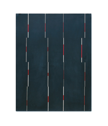
'GLIMPSE (NIGHT)' Resin, clay, and pigment on aluminum panel, by Jeff Kellar. |
Jeff Kellar's work is formal, cool, and reserved, bringing to mind the Dave Brubeck Quartet back in the "Take Five" days, dressed in dark suits and narrow ties with Paul Desmond blowing alto magic under his black horn-rim glasses. Everything was careful, correct, and well-ironed in presentation, but the product was something else.In his new show at Icon Contemporary Art in Brunswick Kellar continues to make paintings that are not quite paintings and sculptures that are not really sculptures. They are elusive objects that courteously undermine whatever you are thinking about when you look at them.
The paintings, if you can call them that, hang on the wall like disembodied color. They are thin aluminum panels that hang suspended a half-inch or so from the wall. The surface is made with a resin, clay, and pigment mix and looks as if it simply existed, rather than having been made. There are enough slight irregularities and texture to give them a sense of being an object. You have a thing that is not trying to be pure light or, in fact, to declare itself anything other than what it is.
But there is information — the cool exterior has some mysterious quality that makes you pay attention. Take, for instance, three large thematically similar works: "Alcoves," "Vanishing Points," and "Street View." Each are about four feet high and five wide, and each are simply black and white, with little modulation. "Alcoves" seems at first glance to be silhouettes of black shapes, perhaps buildings, in perspective. That reading might hold up without the others. "Vanishing Points" is four rows of slightly differing triangles that suggest there's a point somewhere in the distance, and "Street View" is three rows of black irregular polygons that might be masses seen from different vantage points.
Are they just dimensionless shapes or do they represent something? Kellar is too canny an artist to not know he can't have it both ways, at least simultaneously. The hints of representation and allusion to perspective don't sustain. You have your object and must needs take it the way it is. Get over it.
A pair of large works addresses this issue a differently. "Glimpse (night)" and "Glimpse (day)" each about five feet high and four wide, are organized identically, except one is black, the other off-white. Both have four vertical rows of narrow red and white stripes, and each row is broken into four offsets, as if a section had been moved slightly to one side or another.
Like most of Kellar's work it is open to contradictory readings. The vertical stripes can be seen as slots with something passing behind them, calling to mind the classic quantum experiment where electrons are fired through openings and found to behave both as particles and as waves. Or they can be seen as tectonic shifts in the plane of the larger area. Or, simply, color and line with no purpose other than to be themselves.